APPROVED ANSWER
SELECTED ANSWER
replied on May 12
Hi Peter, can you see if this fits your needs.
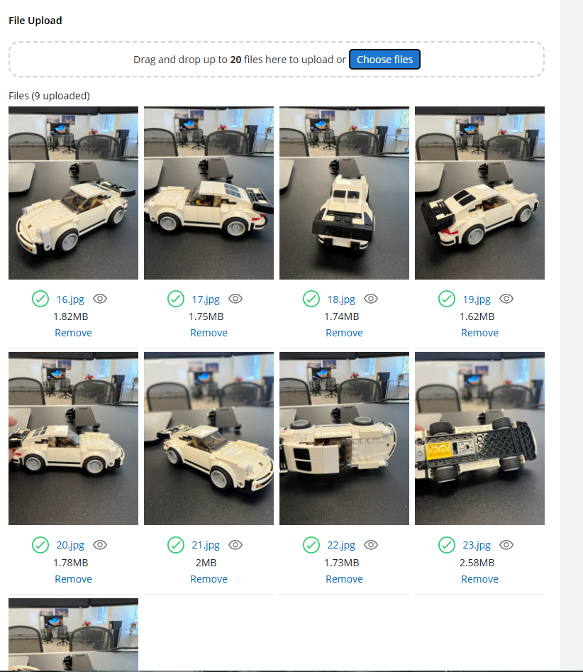
We can use CSS Grid to modify that file upload field. By default it's a table with alternating rows between image preview and the details. For horizonal display of 4 images per row, we can use the following CSS.
- Attach custom CSS Class to the file-upload filed: horizontal-flow
  .horizontal-flow table.uploaded-files { display: block; }
  .horizontal-flow table.uploaded-files tbody {
    display: grid;
    grid-template-columns: repeat(4, 1fr);
    gap: 4px 8px;
  }
  .horizontal-flow tr.uploaded-file { flex-direction: column; }
  .horizontal-flow .uploaded-file-preview-container button { width: 100% !important; }
  .horizontal-flow .uploaded-file-preview-container img { width: 100%; height: auto; }


  /* Group 1 — files 1–4 → visual rows 1–2 */
  .horizontal-flow tbody tr:nth-child(1)  { grid-area: 2/1; }
  .horizontal-flow tbody tr:nth-child(2)  { grid-area: 1/1; }
  .horizontal-flow tbody tr:nth-child(3)  { grid-area: 2/2; }
  .horizontal-flow tbody tr:nth-child(4)  { grid-area: 1/2; }
  .horizontal-flow tbody tr:nth-child(5)  { grid-area: 2/3; }
  .horizontal-flow tbody tr:nth-child(6)  { grid-area: 1/3; }
  .horizontal-flow tbody tr:nth-child(7)  { grid-area: 2/4; }
  .horizontal-flow tbody tr:nth-child(8)  { grid-area: 1/4; }

  /* Group 2 — files 5–8 → visual rows 3–4 */
  .horizontal-flow tbody tr:nth-child(9)  { grid-area: 4/1; }
  .horizontal-flow tbody tr:nth-child(10) { grid-area: 3/1; }
  .horizontal-flow tbody tr:nth-child(11) { grid-area: 4/2; }
  .horizontal-flow tbody tr:nth-child(12) { grid-area: 3/2; }
  .horizontal-flow tbody tr:nth-child(13) { grid-area: 4/3; }
  .horizontal-flow tbody tr:nth-child(14) { grid-area: 3/3; }
  .horizontal-flow tbody tr:nth-child(15) { grid-area: 4/4; }
  .horizontal-flow tbody tr:nth-child(16) { grid-area: 3/4; }

  /* Group 3 — files 9–12 → visual rows 5–6 */
  .horizontal-flow tbody tr:nth-child(17) { grid-area: 6/1; }
  .horizontal-flow tbody tr:nth-child(18) { grid-area: 5/1; }
  .horizontal-flow tbody tr:nth-child(19) { grid-area: 6/2; }
  .horizontal-flow tbody tr:nth-child(20) { grid-area: 5/2; }
  .horizontal-flow tbody tr:nth-child(21) { grid-area: 6/3; }
  .horizontal-flow tbody tr:nth-child(22) { grid-area: 5/3; }
  .horizontal-flow tbody tr:nth-child(23) { grid-area: 6/4; }
  .horizontal-flow tbody tr:nth-child(24) { grid-area: 5/4; }

  /* Group 4 — files 13–16 → visual rows 7–8 */
  .horizontal-flow tbody tr:nth-child(25) { grid-area: 8/1; }
  .horizontal-flow tbody tr:nth-child(26) { grid-area: 7/1; }
  .horizontal-flow tbody tr:nth-child(27) { grid-area: 8/2; }
  .horizontal-flow tbody tr:nth-child(28) { grid-area: 7/2; }
  .horizontal-flow tbody tr:nth-child(29) { grid-area: 8/3; }
  .horizontal-flow tbody tr:nth-child(30) { grid-area: 7/3; }
  .horizontal-flow tbody tr:nth-child(31) { grid-area: 8/4; }
  .horizontal-flow tbody tr:nth-child(32) { grid-area: 7/4; }

  /* Group 5 — files 17–20 → visual rows 9–10 */
  .horizontal-flow tbody tr:nth-child(33) { grid-area: 10/1; }
  .horizontal-flow tbody tr:nth-child(34) { grid-area: 9/1; }
  .horizontal-flow tbody tr:nth-child(35) { grid-area: 10/2; }
  .horizontal-flow tbody tr:nth-child(36) { grid-area: 9/2; }
  .horizontal-flow tbody tr:nth-child(37) { grid-area: 10/3; }
  .horizontal-flow tbody tr:nth-child(38) { grid-area: 9/3; }
  .horizontal-flow tbody tr:nth-child(39) { grid-area: 10/4; }
  .horizontal-flow tbody tr:nth-child(40) { grid-area: 9/4; }
I've added for up to 20 files, but you can add more as needed, just calculate the grid-area based on the same pattern to make sure they fit in the right row/column indexes.
Preview: