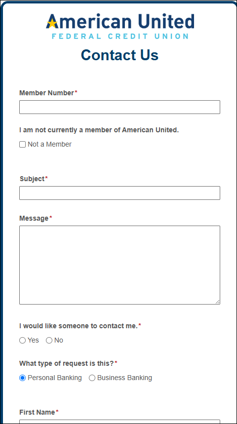
This is some CSS that I re-use on any of my forms that will be publicly available. This is for the Layout Designer (not the Classic Desiger).
/*facilitate rearranging of field rows on small screens*/
@media (max-width: 600px) {
  .line {
    flex-direction: column;
  }
  .pdc
  {
    width: auto;
  }
}

/*facilitate rearranging of form header on small screens*/
@media (max-width: 600px) {
  .form-header {
    flex-direction: column;
    align-items: center;
  }
  .form-info {
    text-align: center;
  }
  .form-logo
  {
    float: none;
    padding-left: 0px!important;
    padding-right: 0px!important;
    margin-left: 0px!important;
    margin-right: 0px!important;
    margin-bottom: 15px!important;
  }
  .form-title
  {
    text-align:center;
    width: 100%!important;
    padding-left: 0px!important;
    padding-right: 0px!important;
    margin-left: 0px!important;
    margin-right: 0px!important;
    margin-bottom: 0px!important;
    flex-wrap: wrap;
  }
}
This will take fields that are side-by-side when full screen and make them a vertical list when on a small screen. It also rearranges the form header to that the title and logo are vertical instead of side-by-side.
Here's a screenshot of one of my forms with full-screen and a phone-sized screen:

