I know I've already mentioned this on one of your posts, so you already know it. But for the sake of any other users that may read this in the future, you are referring to version 11.0 Update 2, not version 11.2, which does not exist at this time (but may in the future).
For future reference, the easiest way to reference your version is to go to Help > About in Forms and copy the version number (You're probably on or near version 11.0.2201.20436).
Regarding your question of if there is any difference with CSS in the two designers. Yes, there is. Because the structure of the form from the Forms Classic Designer is very different than the structure of the Forms Layout Designer - any CSS (or Javascript for that matter) that works for one, will not work for the other without modifications).
Here's some CSS that I reuse on every single Classic Designer form that I create:
/*set re-usable field layouts*/
.hiddenField {display: none!important;}
.noLabel .cf-label {display : none;}
.fivePercentWidth {display : inline-block; width : 5%;}
.fivePercentWidth .cf-field {min-width : 5px;}
.fifteenPercentWidth {display : inline-block; width : 15%;}
.fifteenPercentWidth .cf-field {min-width : 80px;}
.tenPercentWidth {display : inline-block; width : 10%;}
.tenPercentWidth .cf-field {min-width : 80px;}
.quarterWidth {display : inline-block; width : 25%;}
.thirdWidth {display : inline-block; width : 33%;}
.halfWidth {display : inline-block; width : 50%;}
.fortyEigthPercentWidth {display : inline-block; width : 48%;}
.twentyFourPercentWidth {display : inline-block; width : 24%;}
.threeQuarterWidth {display : inline-block; width : 75%;}
.dateField {display : inline-block; width : 25%;}
.dateField .cf-xlarge {width : 80%;}
.twentFourPercentDateField {display : inline-block; width : 24%;}
.twentFourPercentDateField .cf-xlarge {width : 80%;}
.wideLabel .cf-label {width : 300%; max-width : 300%;}
.alignTop {vertical-align: text-top;}
These are a series of class names that can be applied to fields on the form in order to easily layout the structure of the form. Your stated goal:
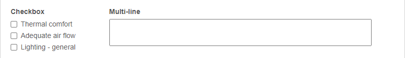
So my current goal is to simply create a checkbox and have a multiline comments field inline with the multiline comment label ontop of it.
Here's how I would tackle that:
- On the Layout Page > Form Settings - change the label alignment from Left to Top.
- Add your checkbox field and give it the CSS Class Names of quarterWidth and alignTop.
- Add your multi-line field and give it the CSS Class Names of threeQuarterWidth and alignTop. Set this field size to be Extra Large so that it fills the full width of the field.
You'll see from the CSS above that those classes are set-up to reduce the maximum width of the fields, so instead of spanning the full screen, they only span a portion of it, and their display value is changed to inline-block. The alignTop class also aligns the contents of the field up to the top, so the row of fields looks aligned across the top of them.
The result should look something like this:
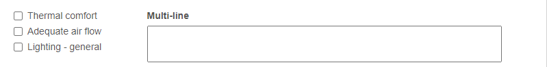
Your screenshot showed the checkbox field without a label, and @████████' comment including hiding the label. The CSS I shared above has an option for that, with the noLabel class. Adding that to the checkbox looks like this:
Here's another fun thing to do with labels. Let's say I have a longer label that really applies to multiple fields. I'll add the long title to the first field, and include the wideLabel class, which will allow that label to exceed the width of the field. Then the second field, I'll leave the label blank. I won't include the noLabel class, because I want the spacing for the label to remain. It looks like this:
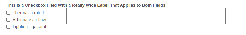
This doesn't look exactly right, so I would probably mess around with it a bit more, and maybe create a new CSS Class just for that multi-line field on this form, but it kind of gives you an idea of how this stuff can work.