Janice,
The problem you're having is that the layout is controlled by the display style inherited from the classes, not by the text alignment ("display:block;" vs "display:inline-block;").
When you set your fields to "Left" display it adds multiple styling attributes to the child elements that might take a lot more work to reproduce.
A better options might be to go the other way around:
- Set the form to "Left" instead of "Top"
- Add "top-align" to the custom css class for each element you want set up that way

- Add one of the following to the form's CSS
/*Targets immediate children of the element*/
/*Automatically overrides the other classes*/
/*Will affect both the label AND the field*/
.top-align > * {
  display:block;
}

/*Targets the label element specifically*/
/*Requires "!important" to override other classes*/
/*The field will keep the inline-block styling*/
.top-align label {
  display:block !important;
}
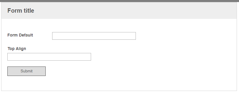
Either of those will give you the following results

You might still need to do some fine-tuning to get exactly what you want, but this will be a lot less work than changing it from "Top" to "Left" through CSS.
On a side note, I'd recommend avoiding any style changes using JavaScript/JQuery because those only occur when the form is loaded in a browser and won't apply on the resulting PDF/TIFF pages.