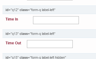
This would just need some additional CSS added. I have a similar set-up on one of my forms and when I do side-by-side elements, this is the general CSS set-up I use:
/*Time In & Time Out*/
#q12, #q13 {
  display: inline-block;
  vertical-align: top;
}
#q12 {
  width: 265px;
}
#q13 {
  width: 400px;
}
#q12 label.cf-label {
  width: 90px;
}
#q13 label.cf-label {
  width: 70px;
}
#q12 div.cf-field, #q13 div.cf-field {
  width: 130px;
}
#Field12, #Field13 {
  width: 150px;
}
This is how it looks while on the CSS/JS tab:

and the final look with the CSS looks like (during Preview):

That usually gets me close to what I want and then I just tweak it per how it needs to be. If you have any questions please feel free to ask.